The Psychological Background to Color.
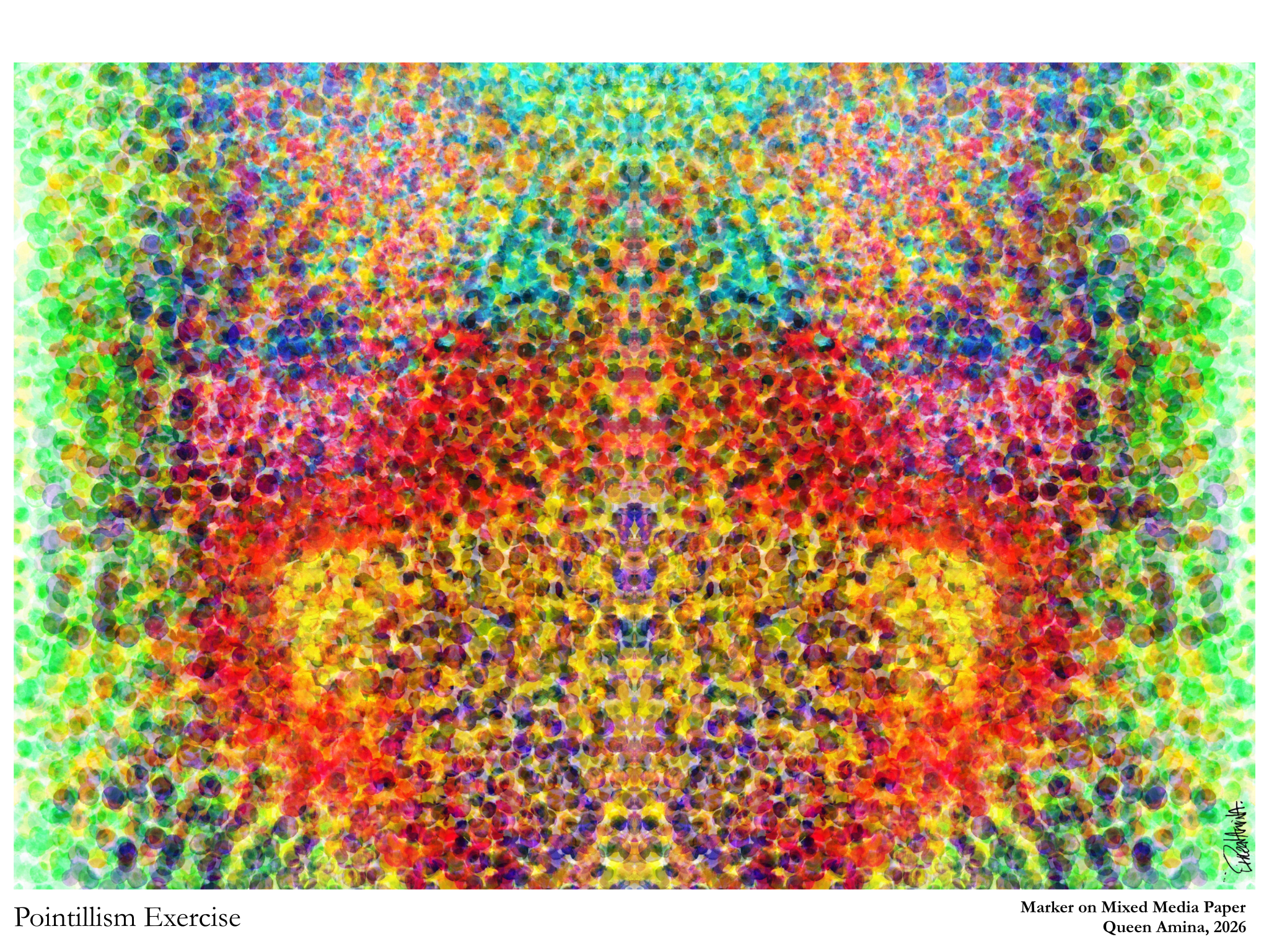
This excerpt spoke on how color itself sparked interest in scientists, historians, and artists as they began experimenting with color on a psychological level and wanting to understand the phenomenon even more. Classic studies like Theory of Colours (1810) and The Principles of Harmony and Contrast of Colors (1839), set the tone for the study of color, bleeding into the birth of various art forms. Neo Impressionism was one of the first, basing its technique on color perception and understanding how color acts in the eye. This is where we’re introduced to movements like Pointillism, and where artists began to treat color more as a composition and force within itself.
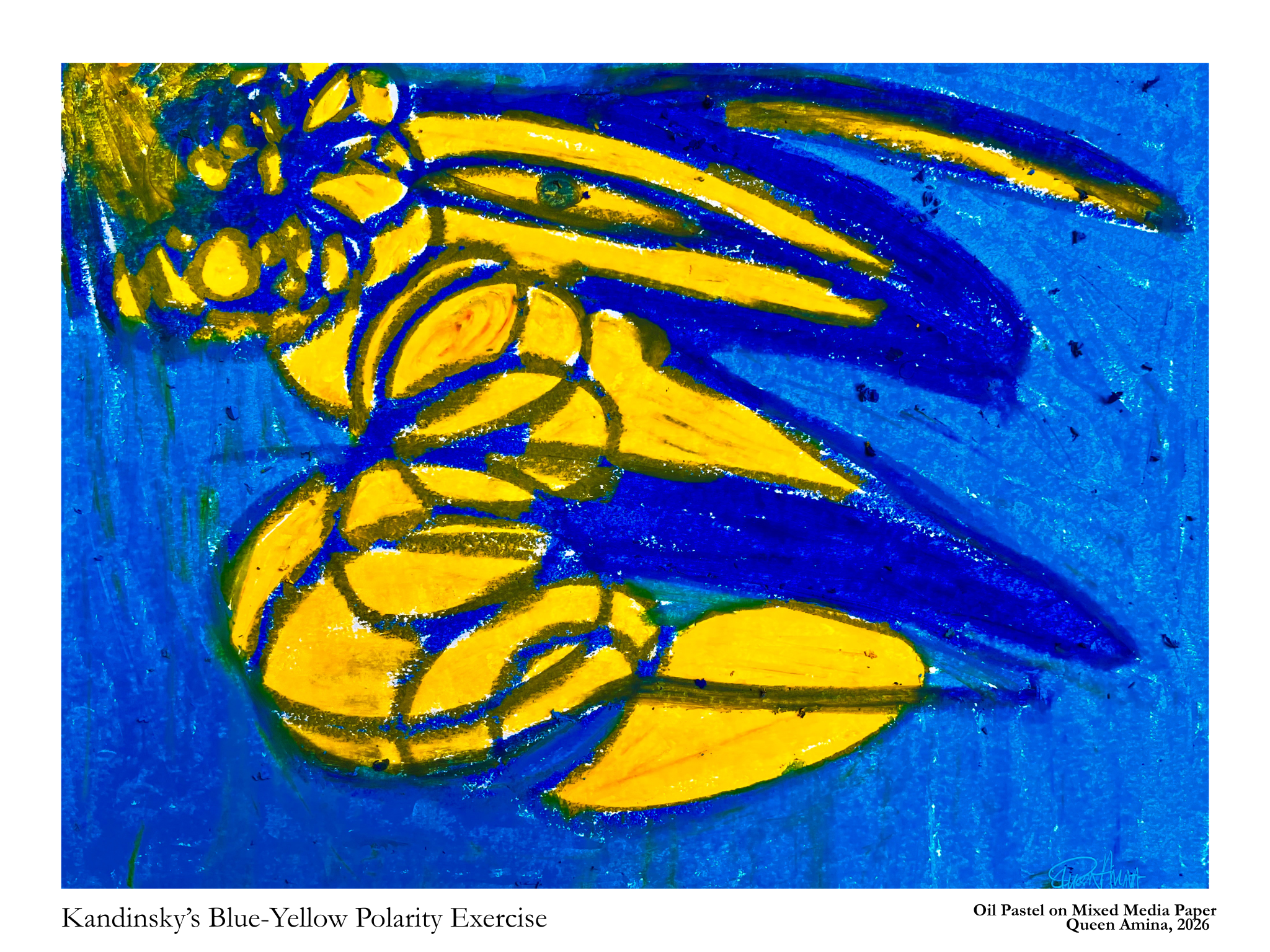
Conclusions were made when it came to color, emotions, and associations. (When you think of the color red: do you first think of the way it makes you feel or objects that are red?) Psychologist Florian Stefanescu-Gogna came to the conclusion that feelings produced by colors were the direct effect of sensory perception, rather than associations. Color dynamics and polarities were then studied, analyzing how contrast and visual stimulation affected the mind, as seen in Wassily Kandinsky’s polarity between yellow and blue. (Idea originally derived from A. Osborne Eaves’ The Power of Colors, 1906, but he compared the polarity between red and blue)
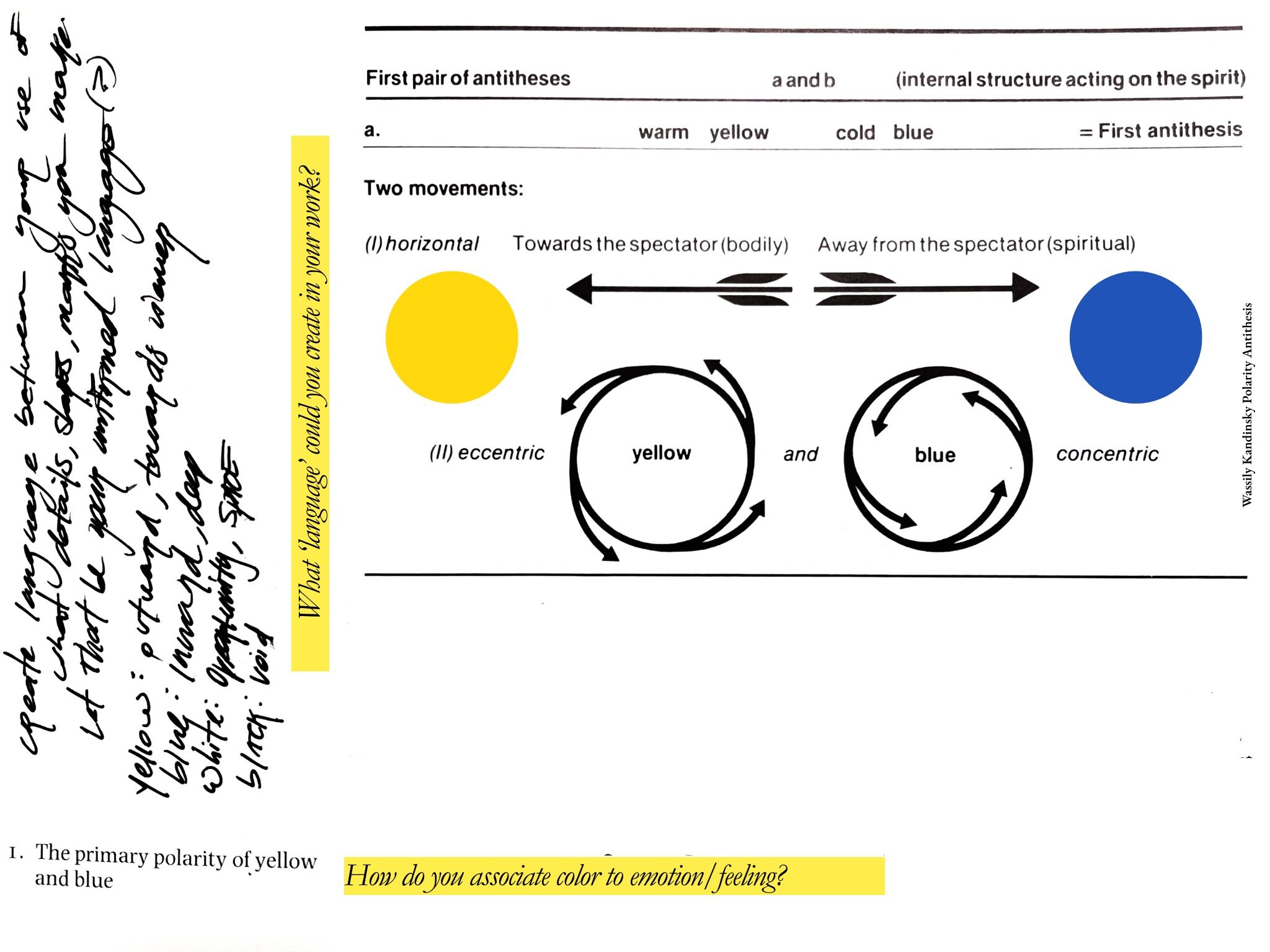
Wassily Kandinsky Polarity Antithesis
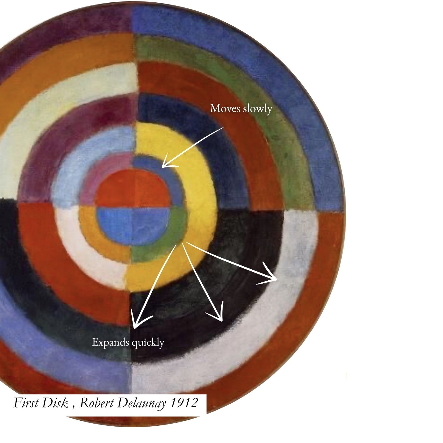
At the end of 1912 Robert Delaunay called his style of painting Simultané (simultaneity) focusing on contrast and discovering the movement of colors. Delaunay shared these ideas with Kandinsky, with references notably from Cercle Chromatique (1888) where it was presented that red moved vertically upwards, blue horizontally from right to left, and yellow from left to right. Delaunay initially believed this movement came from layered transparency, but later argued it was more strongly caused by variations in hue/color contrast, in his The Essay on Light. Delaunay’s First Disk 1912 marks where he began to work out his compositions with contrast, focusing on complementary contrasts of color and testing the effects of certain combinations
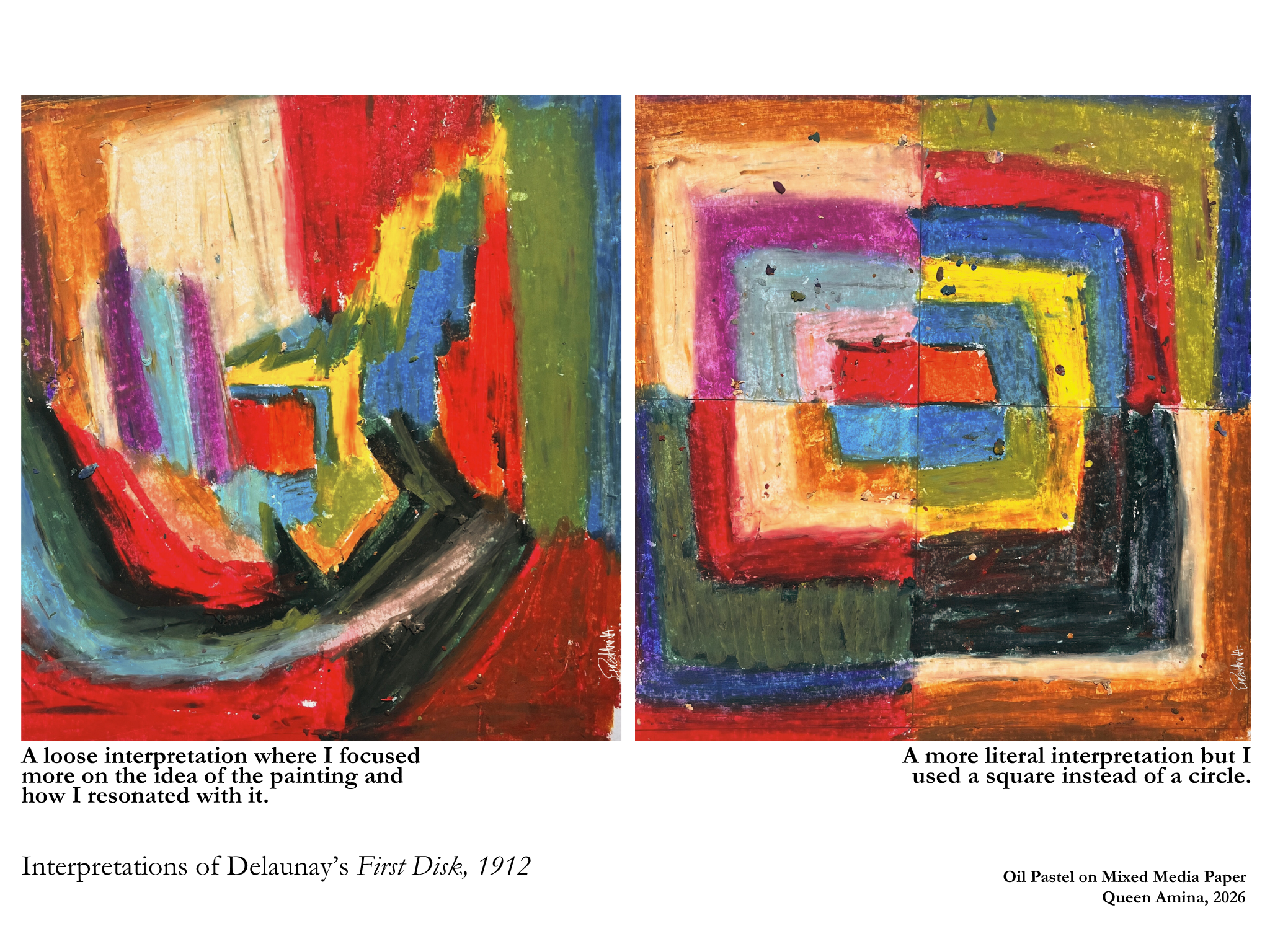
Working through these exercises made me realize that my attraction to bold contrasts and vibrant color isn’t just a personal preference, it’s rooted in the very ways humans perceive and respond to color. The “vibrating” effect I’ve always loved when using strong complementary colors is the same phenomenon that artists and scientists have studied for centuries. Understanding this history and science has deepened my awareness of color’s emotional and visual impact, and it’s why I deliberately include pops of color in my work, to create moments that engage the eye, spark curiosity, and invite the viewer into the same sensory experience that first drew me to paint.